LUMO MUSEUM BRANDING
The challenge was to create a contemporary, spatial, and immersive identity for a museum that exhibits artworks from artists of the light and space movement. These artists utilize the latest technology to explore the boundaries between light and space, immersing the audience in a sensory journey of light. (School Project)
Solution
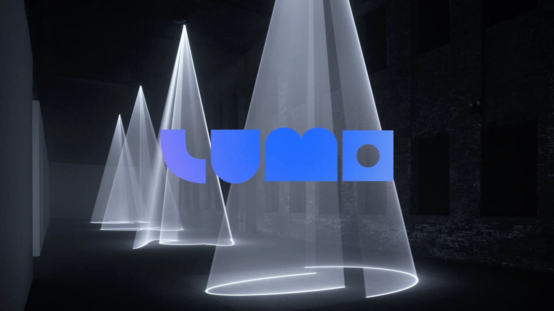
The name “LUMO” reflects a longing for more immersive encounters with diverse light phenomena. The design of the logo, inspired by the interplay of light, volume, and scale, mirrors a geometric space where light experiments come to life.
Typeface & Colors
Typeface Poppins was chosen for the brand’s headline and body copy which enhances the brand identity of modernism.
The neon colors and technological aspects of light arts led to the selection of ultramarine blue and neon pink as the primary color palette. The secondary color palette includes cream yellow, yale blue, and ice blue, which combine with the primary colors to create a visually immersive light phenomenon.


Visual System
The visual identity system employs the geometric letter shape of the logo as a graphic device which is used to crop or highlight the light artworks to create a spatial, modern light image.


Business Cards

Letterhead

Brochures
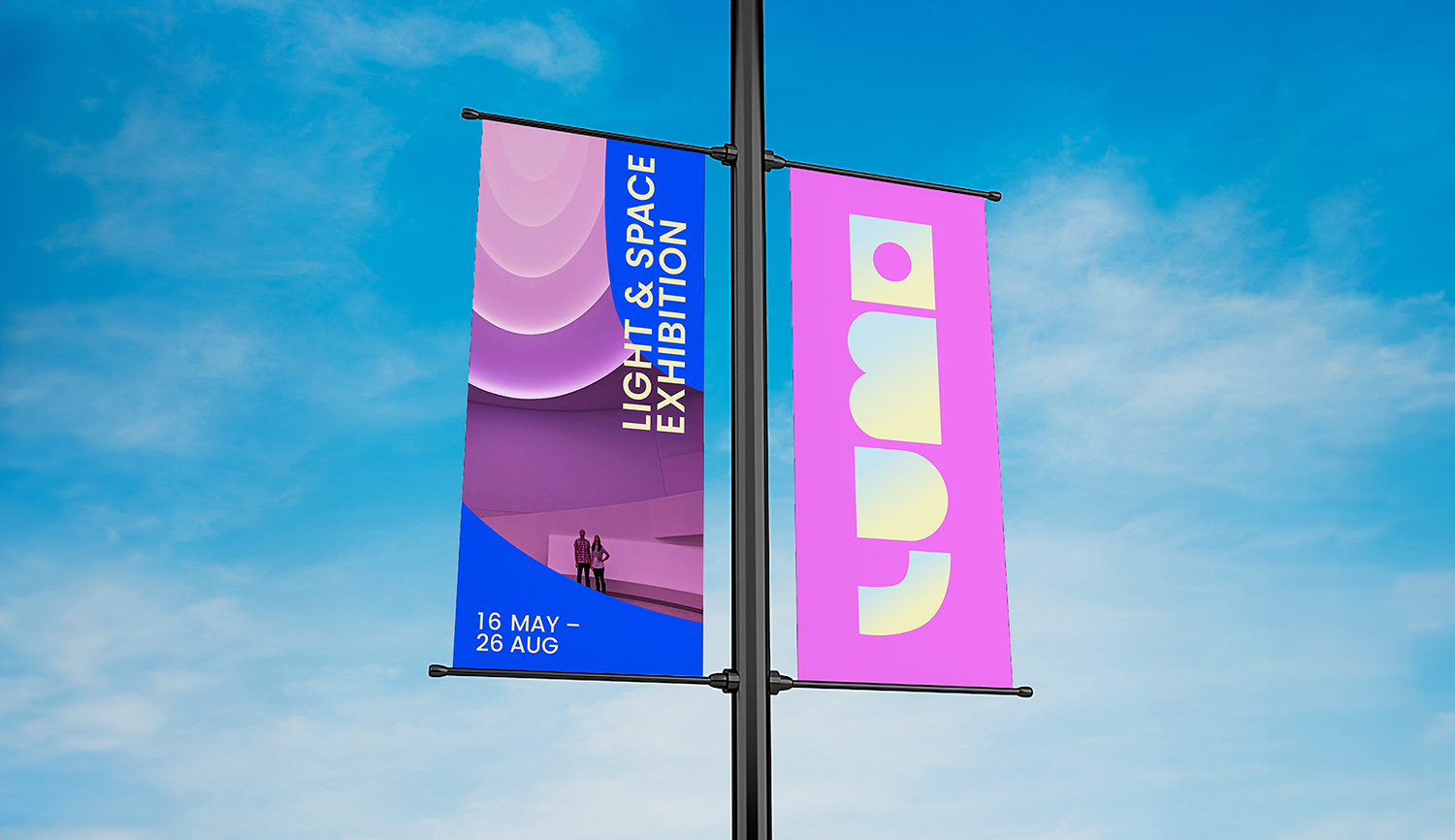
Banners

Pins

Tote Bag
*Photos and quotes used in this student project are from online resources. These photos are all artworks from artists of the light and space movement.